
LGBTIQA+
Inclusive Branding
LGBTIQA+
Inclusive Branding
Branding
Publication
Campaign
Social Media
Signage
Led the visual identity for the State’s first LGBTIQA+ Inclusion Strategy, managing production from initial concept to ministerial delivery.
Led the visual identity for the State’s first LGBTIQA+ Inclusion Strategy, managing production from initial concept to ministerial delivery.
LGBTIQA+
Inclusive Branding
Branding
Publication
Campaign
Social Media
Signage
Led the visual identity for the State’s first LGBTIQA+ Inclusion Strategy, managing production from initial concept to ministerial delivery.

Visual Identity & Concept
The design uses a vibrant, layered approach to reflect the challenges and voices of the LGBTIQA+ community. By combining expressive cover art with structured typography, the identity balances these experiences within a professional layout, ensuring clear messaging that meets formal government standards.


Visual Strategy Challenge
The primary challenge was aligning hand-drawn illustrations by community member Tiger Bird with existing government branding. As a core part of the Inclusion Strategy, these artworks represent the authentic voices of the community. I developed a consistent layout system to ensure a seamless balance between meaningful imagery and formal requirements.
The visual strategy was implemented across three key stages: Introduction, Strategy, and Priority Areas.

01. Introduction: Setting a community-focused tone
Utilises organic and bold illustrations to build familiarity and encourage engagement. The design prioritises a welcoming atmosphere to reflect the community's voice.
01. Introduction: Setting a community-focused tone
Utilises organic and bold illustrations to build familiarity and encourage engagement. The design prioritises a welcoming atmosphere to reflect the community's voice.


02. Strategy: Simplifying complexity through visual impact
Applies bold colours and sharp geometric shapes to create high-impact infographics. This approach transforms complex data into accessible visual narratives while maintaining professional clarity.
02. Strategy: Simplifying complexity through visual impact
Applies bold colours and sharp geometric shapes to create high-impact infographics. This approach transforms complex data into accessible visual narratives while maintaining professional clarity.

03. Priority Areas: Structural efficiency with a rainbow motif
Features a four-colour coding system and rainbow-inspired arches to improve information flow. This ensures the document meets government standards while subtly celebrating the identity of the community.
03. Priority Areas: Structural efficiency with a rainbow motif
Features a four-colour coding system and rainbow-inspired arches to improve information flow. This ensures the document meets government standards while subtly celebrating the identity of the community.

Project Outcome
The project concludes with impactful illustrations and strong contrast, delivering clear messaging that effectively resonated with the community.
Project Outcome
The project concludes with impactful illustrations and strong contrast, delivering clear messaging that effectively resonated with the community.


Action Plan: Information Design
I applied a colour-coded system to the report’s tables and data sets, transforming complex data into a clear visual format. This significantly enhanced readability and improved the information flow for better accessibility.
Action Plan: Information Design
I applied a colour-coded system to the report’s tables and data sets, transforming complex data into a clear visual format. This significantly enhanced readability and improved the information flow for better accessibility.


Campaign Collateral
The posters and digital assets were designed to work as a consistent set or as standalone pieces. By using bold purple tones and organic lines, the design aligns with the original artwork to strengthen the strategy’s core message.
Campaign Collateral
The posters and digital assets were designed to work as a consistent set or as standalone pieces. By using bold purple tones and organic lines, the design aligns with the original artwork to strengthen the strategy’s core message.


Design Assets
I developed cohesive event materials, including t-shirts, by adapting key visual elements for a unified message. My focus was on consistent branding, turning event visuals into clear functional assets.
Design Assets
I developed cohesive event materials, including t-shirts, by adapting key visual elements for a unified message. My focus was on consistent branding, turning event visuals into clear functional assets.

Visual Identity & Concept
The design uses a vibrant, layered approach to reflect the challenges and voices of the LGBTIQA+ community. By combining expressive cover art with structured typography, the identity balances these experiences within a professional layout, ensuring clear messaging that meets formal government standards.


Visual Strategy Challenge
The primary challenge was aligning hand-drawn illustrations by community member Tiger Bird with existing government branding. As a core part of the Inclusion Strategy, these artworks represent the authentic voices of the community. I developed a consistent layout system to ensure a seamless balance between meaningful imagery and formal requirements.
The visual strategy was implemented across three key stages: Introduction, Strategy, and Priority Areas.

01. Introduction: Setting a community-focused tone
Utilises organic and bold illustrations to build familiarity and encourage engagement. The design prioritises a welcoming atmosphere to reflect the community's voice.


02. Strategy: Simplifying complexity through visual impact
Applies bold colours and sharp geometric shapes to create high-impact infographics. This approach transforms complex data into accessible visual narratives while maintaining professional clarity.

03. Priority Areas: Structural efficiency with a rainbow motif
Features a four-colour coding system and rainbow-inspired arches to improve information flow. This ensures the document meets government standards while subtly celebrating the identity of the community.

Project Outcome
The project concludes with impactful illustrations and strong contrast, delivering clear messaging that effectively resonated with the community.


Action Plan: Information Design
I applied a colour-coded system to the report’s tables and data sets, transforming complex data into a clear visual format. This significantly enhanced readability and improved the information flow for better accessibility.


Campaign Collateral
The posters and digital assets were designed to work as a consistent set or as standalone pieces. By using bold purple tones and organic lines, the design aligns with the original artwork to strengthen the strategy’s core message.

Design Assets
I developed cohesive event materials, including t-shirts, by adapting key visual elements for a unified message. My focus was on consistent branding, turning event visuals into clear functional assets.
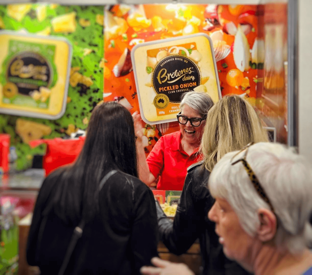
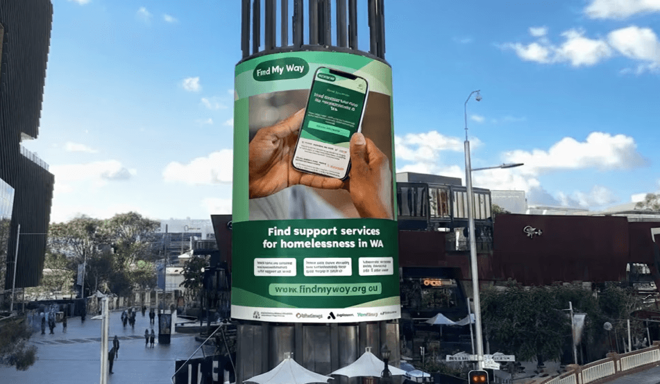
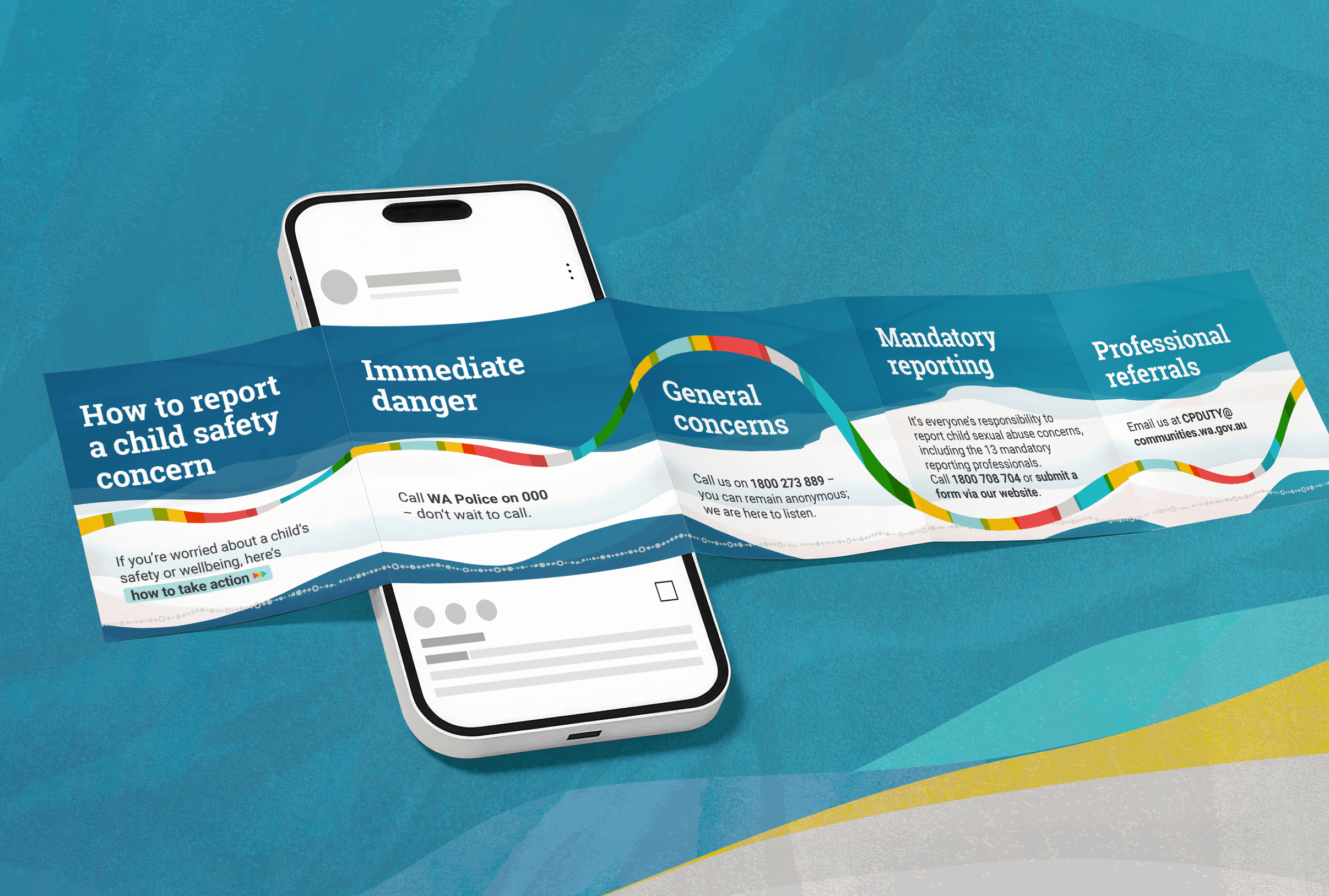
Projects
Other works
Projects
Other works
Projects
Other works


Contact
Work with me
I take the time to understand your goals and translate them into clear, effective visual outcomes that actually work.
You can contact me at:
Hayley.Lee.Graphic@gmail.com
Based in
★ Perth, WA
24 Sandra Way, Rossmoyne WA 6148
0420 925 357
Contact
Work with me
I take the time to understand your goals and translate them into clear, effective visual outcomes that actually work.
You can contact me at:
Hayley.Lee.Graphic@gmail.com
Based in
★ Perth, WA
24 Sandra Way, Rossmoyne
0420 925 357
Contact
Work with me
I take the time to understand your goals and translate them into clear, effective visual outcomes that actually work.
You can contact me at:
Hayley.Lee.Graphic@gmail.com
Based in
★ Perth, WA
24 Sandra Way, Rossmoyne WA 6148
0420 925 357